illustration
My illustration style is very heavily graphics-based using illustrator to create mostly cartoon-like artwork. I like to use vibrant, happy colours for my portrait style art and, while my other artwork seems to lack these happy colours, I still make sure to use colour. For example, using deep blues for nightscapes rather than keeping it grayscale.
My first illustration was the bright blue one which is a self-portrait however this caught on and now I am working through a list of people who have asked to have them done. Any other illustration so far has been purely stuff I have made in my own time just to get some creativity flowing, to learn new skills or make an adaptation of a work I've seen before.


Awareness Poster
I knew the best option for this topic was to go with typography and try to raise awareness through my poster by giving my audience an insight
I first had a look at all the options for my poster and landed on the option of "Dyslexia" which I felt left me with the most possible typographic routes and also related the closest to a lot of known graphic designers.
This was my final outcome done in college following a brief to make an awareness poster about learning difficulties. in to how a person with this learning difficulty would read a normal sentence.
Obviously, not having dyslexia myself made it worrying to assume how people, with this learning difficulty, would read a sentence although I felt to get the message across I needed to exaggerate which many famous awareness posters do anyway.
The idea behind the typography was to try and trick my audience into reading each word as a sentence and pausing at the full stop to make the quick sentence into more of a stuttered read. This was then accompanied by a quick, simple and relatable illustration of someone holding a book with no eyes to hint again at how they struggle to read compared to us without Dyslexia.
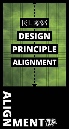
Blast or Bless Banner
The brief was to do with this new block and I was given three colours to choose from which related to the college's current colour scheme as well as the option out of Bless or Blast. Which is an old concept from the British Vorticist movement which published their first edition of "Blast" in
This banner was a quick design for the new arts block at my college to give visitors and current designers ideas on what we are capable of as well as being a response to a brief. Most design today works with grids, guidelines and snap points for logos, banners and websites etc. This meant in my piece I would try and include as many examples of alignment as possible using a bold, dotted middle line. Little alignment lines, a lot like the ones in the
Their magazine was almost a whole book of typographic messages describing what they didn't like, as a group, at the time. This meant I had to take this idea and create either a Blast or Bless piece on any design principle which I either didn't like or did like. I obviously went with Bless as a thing I did like as well as the design principle of alignment.1914.Adobesoftwares and even alignment in the title at the bottom. I then picked green from my three colour choices as a colour for "Good" to really back up the fact that it was something I liked and then used the cloud background as another match for the word "Bless" which, in my opinion, sounds almost holy and religious like Heaven commonly believed to be up away in the clouds.

Logos
Logos are where my love for design started, back when I was only 12 creating logos for friends YouTube profile pictures in exchange for lunch money.
Unfortunately, not long ago my old laptop decided life had come to its ends and shut itself down, never to be opened again. Which, although sad, was very annoying as it contained a lot of my original logos. Luckily, I was a also into making YouTube videos out of the process of creating the logos and banners at that time so the majority can be found in showreel videos, tutorials and speed arts on my old YouTube channel.
For my YouTube Channel click the button.
Editorial & Front Covers
Editorial Design is a form of design I have come across a view times now in my Graphic Design course first being a Gaming Magazine on a topic of Editorial Design and secondly when I created Mute. My urban fashion/skate magazine for my final personal investigation.
My editorial design in the first topic was very rough and I am not the proudest of the design within it however I do quite like some of the illustrations I had created in the ends and some of the layouts. Unfortunately, simplicity never seemed to occur to me when I started my Graphic Design Course so cramming everything in one viewpoint seemed to be my way forward.
As you will be able to notice quite easily when
comparing the two is I managed to lay off a bit
in the section one which was definitely for the best,
if I do say so myself.
Click on the link to view the magazine.